


Dvůr roztříštěné harmonie: Vyplatilo se čekání na další díl ACOTARu? | RECENZE
Fanoušci čekali pět let, než se budou moci vrátit do Prythianu a ke svým...


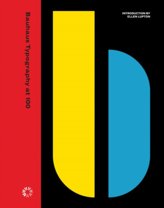
Kniha ( pevná vazba )


An unprecedented, definitive look at the school’s typography and print design, from its early expressive tendencies to the functional modernism for which it is famed todayThe Bauhaus looms large as one of the most influential legacies in 20th-century graphic design. Known for its bold sans-serif typefaces, crisp asymmetrical grids and clean… Přejít na celý popis


5.0 z 5 hvězdiček
Voucher
An unprecedented, definitive look at the school’s typography and print design, from its early expressive tendencies to the functional modernism for which it is famed today
The Bauhaus looms large as one of the most influential legacies in 20th-century graphic design. Known for its bold sans-serif typefaces, crisp asymmetrical grids and clean use of negative space, the school emerged as the forebearer of a new look—one that seized the tools of mass production in the creation of a radical new art. Today, just over 100 years after the Bauhaus’s opening in 1919, the school’s visual hallmarks have come to define modernity as it appears on the printed page.The official catalog for Letterform Archive’s inaugural gallery exhibition, Bauhaus Typography at 100 explores the school’s legacy in graphic and typographic design through artifacts of its own making—its books, magazines, course materials, product catalogs, stationery, promotional fliers and other ephemera.From the book’s beautifully designed pages, readers learn of typographic masters László Moholy-Nagy, Herbert Bayer and Joost Schmidt, who channeled Constructivism’s geometric forms and optimism for industry into printed vehicles for the school’s teachings. Here is where Bauhaus typography—its rejection of serifs and capitals, embrace of experimental alphabets, insistence on universal clarity, and innovation in layering and hierarchy—took its distinctive shape.The catalog also shines light on the Bauhaus’s lesser-known early forays into expressive lettering and illustration, also tracing the school’s immediate impact on seminal design movements such as the New Typography and, of course, on design practitioners working today. Lavishly illustrated, carefully researched and written, and accompanied by an in-depth introduction from noted Bauhaus expert, author and curator Ellen Lupton, Bauhaus Typography at 100 is a must-have for any fan of modern design.
0.0 z 5 0 hodnocení čtenářů
0× 5 hvězdiček 0× 4 hvězdičky 0× 3 hvězdičky 0× 2 hvězdičky 0× 1 hvezdička
Získejte přehled o vývoji ceny za posledních 60 dní.
Fanoušci čekali pět let, než se budou moci vrátit do Prythianu a ke svým...
Každý z nás si z dětství pamatuje to příjemné těšení na otevření...
Nejdřív divákům zamotal hlavu jako tajemný upír Edward Cullen, potom...
Kolik lidí se vejde do jedné duše? Na velmi krátký okamžik to byl Tyrone...
Marvel si zjevně řekl, že nás před premiérou Avengers: Doomsday nenechá...
Mezi tvými oblíbenými romány se rozsvítila malá japonská ulička. Má...
Listopad si přímo říká o večery strávené s knihou. Venku se brzy...
Po úspěšných knihách s Erikou Fosterovou a Kate Marshallovou se Robert...
Vánoce jsou za dveřmi a s nimi přichází i každoroční otázka: Co letos...
Perfektní dárek pro fanoušky královny motorsportu
Legendární jezdci, ikonické stáje, fascinující statistiky a rekordy, ze kterých se vám zatočí hlava, v jedinečném průvodci strhujícím světem Formule 1.
Mohlo by vás zajímat
Být sám sebou může být ten nejtěžší zápas
Kapitán týmu. Syn trenéra. Jeden tajný polibek, který změní vše...
Mohlo by vás zajímat
Kdo smí rozhodnout o konci?
Když se eutanázie stane legální možností, musí se Nora rozhodnout o životě své těžce nemocné dcery. Příběh jedné rodiny otevírá otázky o utrpení, lásce a právu rozhodovat o smrti.
Mohlo by vás zajímat
Bradavice volají o pomoc!
Od prvních kouzelnických krůčků až po epický souboj s temnotou! Harry Potter: Boj o Bradavice vás provede sedmi příběhovými roky, během kterých budete získávat nová kouzla, spojence i schopnosti.
Mohlo by vás zajímat
HUNTR/X hlásí další hvězdu do sbírky!
Mira v ikonickém outfitu z vystoupení „Golden“. S růžovými vlasy, stylovou bundičkou a výrazným pódiovým vzhledem je připravená zazářit na scéně i v boji proti démonům.
Mohlo by vás zajímat
Štědrý den je blíž s každým douškem!
Čtyřiadvacet dní, čtyřiadvacet voňavých překvapení. Adventní kalendář s bio čaji promění čekání na Ježíška v kouzelný rituál plný chutí, vůní a malých každodenních radostí.
Každý měsíc společně přečteme tisíce knih







Tento web je chráněn službou reCAPTCHA a platí pro něj Zásady ochrany soukromí a Smluvní podmínky. | © 2001–2026 DOBROVSKÝ s.r.o. Všechna práva vyhrazena.








 KnihyDobrovsky.cz
 knihydobrovsky
 @knihydobrovskycz
 @knihydobrovsky