
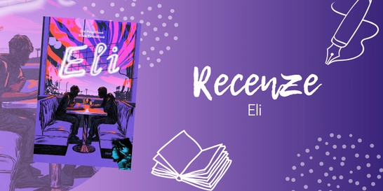
Eli: queer romance plná bolesti i ryzí lásky | RECENZE
Tahle kniha se ke mně původně dostala jen proto, abych ji předala někomu z...

Kniha ( pevná vazba )
1 181 Kč s DPH
Běžně 1 320 Kč
Nápověda
Jsme transparentní


Při zaslání zboží balíčkem
K nákupu nad 1699 Kč dárek zdarma v hodnotě 198 Kč
Stalinova baletka - Příběh odvahy a boje o přežití v sovětském Rusku
Showcasing creative pairings and ingenious applications of Serif and Sans Serif typefaces as well as a rich selection of type specimen, Sans in Use and Serif in Use act as a reference point to inspire type designers and type lovers alike. In the world of typography, it is not uncommon to see combinations of serif and sans serif typefaces in… Přejít na celý popis

Showcasing creative pairings and ingenious applications of Serif and Sans Serif typefaces as well as a rich selection of type specimen, Sans in Use and Serif in Use act as a reference point to inspire type designers and type lovers alike. In the world of typography, it is not uncommon to see combinations of serif and sans serif typefaces in the same design. However, it takes skill to combine them in order to avoid tension and clashes, and ensure maximum readability of the text in the design.
From font weights to classifications, each font has its own distinct personality, and should be carefully paired to convey the right tone and mood of the design. Featuring a selection of type specimens, their design applications, and the thoughts that go behind the craft, Sans in Use / Serif in Use collates the best combinations of the two typeface categories and serves as a reference point for inspiration-seeking designers and typographers alike.
0.0 z 5 0 hodnocení čtenářů
0× 5 hvězdiček 0× 4 hvězdičky 0× 3 hvězdičky 0× 2 hvězdičky 0× 1 hvezdička
Získejte přehled o vývoji ceny za posledních 60 dní.
Tahle kniha se ke mně původně dostala jen proto, abych ji předala někomu z...
Nestihli jste naše žhavé literární odpoledne na Masarykově nádraží, nebo...
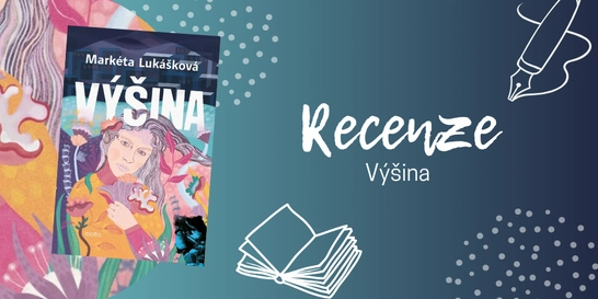
Pokud nevíte, zda sáhnout po „nové Lukáškové“, váš osobní...
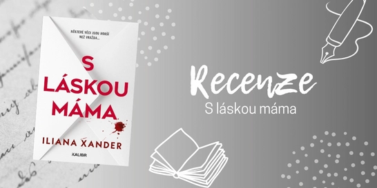
Po dočtení poslední knihy, která byla na můj vkus až příliš...
Už jste také někdy spadli do pasti algoritmu sociálních sítí? Znáte to....
Ne vždycky má člověk chuť vyrážet na nákup do obchodního centra. Někdy...
Pokud jste unavení ze všech těch varování, že světu hrozí atomová válka...

Od letošního CinemaConu už uběhlo pár týdnů, ale moje nadšení z...
Po knize Pošta Jindekde jsem sáhla hlavně proto, že mám tvorbu Emily J....
1 181 Kč s DPH
Běžně 1 320 Kč
Jsme transparentní
Každý konec je začátek něčeho nového
Po smrti manžela odjíždí Pixie na francouzský zámek, který spolu koupili. Místo nového začátku tam ale objeví tajemství, které jí převrátí celý život.

Mohlo by vás zajímat
První detektivka od královny české fantastiky
Příběh, jaký by napsala Agatha Christie, kdyby chtěla, aby byl její hrdina Čech s krizí středního věku.
Mohlo by vás zajímat
Zběsilý postapo svět. Tvrdá pravidla.
Druhý díl, který přitvrzuje. Sněgoňová & Kotleta servírují Arénu, kde přežijí jen ti nejtvrdší. Ostatní skončí jako krmivo.
Mohlo by vás zajímat
Kdo jako první vyloží všechny dílky?
Jednoduchá pravidla. Napínavá hra. Barevná bitva může začít!
Mohlo by vás zajímat
Mohlo by vás zajímat
Barevná zábava pro malé umělce
Ideální aktivita na klidné odpoledne, deštivý den nebo kreativní chvilku bez obrazovek.
Mohlo by vás zajímat
Modrá klasika do každé aktovky
Žádné zbytečné kouzlení, jen poctivý sešit pro každodenní psaní.
Každý měsíc společně přečteme tisíce knih


Tento web je chráněn službou reCAPTCHA a platí pro něj Zásady ochrany soukromí a Smluvní podmínky. | © 2001–2026 DOBROVSKÝ s.r.o. Všechna práva vyhrazena.
 KnihyDobrovsky.cz
 knihydobrovsky
 @knihydobrovskycz
 @knihydobrovsky